# init repo notebook
!git clone https://github.com/rramosp/ppdl.git > /dev/null 2> /dev/null
!mv -n ppdl/content/init.py ppdl/content/local . 2> /dev/null
!pip install -r ppdl/content/requirements.txt > /dev/null
Continuous distributions#
import numpy as np
from scipy import stats
import matplotlib.pyplot as plt
import pandas as pd
from rlxutils import subplots
import sys
import init
import seaborn as sns
%matplotlib inline
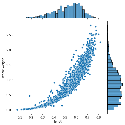
a continuous joint distribution#
from UCI ML repository, Abalone dataset
x = pd.read_csv("local/data/abalone.data.gz",
                names=["sex", "length", "diameter", "height", "whole weight", "shucked weight",
                         "viscera weigth", "shell weight", "rings"])
x.head()
| sex | length | diameter | height | whole weight | shucked weight | viscera weigth | shell weight | rings | |
|---|---|---|---|---|---|---|---|---|---|
| 0 | M | 0.455 | 0.365 | 0.095 | 0.5140 | 0.2245 | 0.1010 | 0.150 | 15 |
| 1 | M | 0.350 | 0.265 | 0.090 | 0.2255 | 0.0995 | 0.0485 | 0.070 | 7 |
| 2 | F | 0.530 | 0.420 | 0.135 | 0.6770 | 0.2565 | 0.1415 | 0.210 | 9 |
| 3 | M | 0.440 | 0.365 | 0.125 | 0.5160 | 0.2155 | 0.1140 | 0.155 | 10 |
| 4 | I | 0.330 | 0.255 | 0.080 | 0.2050 | 0.0895 | 0.0395 | 0.055 | 7 |
sns.jointplot(data=x, x="length", y="whole weight", kind="scatter")
<seaborn.axisgrid.JointGrid at 0x7fe7bd45fa30>
probabilities#
usually there are two things we want to do when we have a probability distribution, compute probabilities and sampling
These is an empirical joint and continuous distributions.
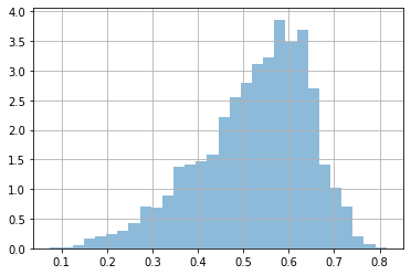
Let’s focus on the marginals. Observe that our dataset is not made of counts (as in previous notebook), but actual values.
We can compute probabilities, by using the empirical data and counting.
dlen = x['length'].values
plt.hist(dlen, bins=30, density=True, alpha=.5);
plt.grid();
# prob len > 0.5

np.mean(dlen>0.5)
0.6191046205410582
observe that it does not make much sense to ask for a specific value for two reasons:
we are using data to compute probabilities, it is very unlikely that we have data for any specific value
probabilities for a continuous distribution are infinitesimal
# observe that it does not make much sense to ask for a specific value
#
np.sum(dlen==0.6)/len(dlen)
0.02082834570265741
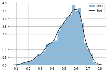
or we can approximate it by estimating a continuous function, with KernelDensity
from sklearn.neighbors import KernelDensity
kde = KernelDensity(kernel='gaussian', bandwidth=0.02).fit(dlen.reshape(-1,1))

# kde provides log probabilities, so we make a utility function
P = np.vectorize(lambda x: np.exp(kde.score_samples([[x]]))[0])
r = np.linspace(np.min(dlen), np.max(dlen), 100)
plt.hist(dlen, bins=30, density=True, alpha=.5, label="data");
plt.plot(r, P(r), color="black", label="kde")
plt.grid()
plt.legend()
<matplotlib.legend.Legend at 0x7fe7bb0bb100>
we can know compute any infinitesimal probability
P(0.5)
array(2.7263704)
observe that the infinitesimal probability can be >1, but the integration is 1.
from scipy.integrate import quad
quad(P, np.min(dlen), np.max(dlen))[0]
0.9996487658772713
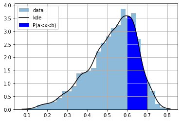
In continuous distributions it only makes sense to ask for probabilities of intervals. The CDF is useful for this, but KDE does not provide a CDF.
Let’s implement it following
# note very efficient but works
CDF = np.vectorize(lambda x: quad(P, np.min(dlen), x)[0])
CDF(.2)
array(0.01128567)
plt.plot(r, CDF(r))
plt.grid()
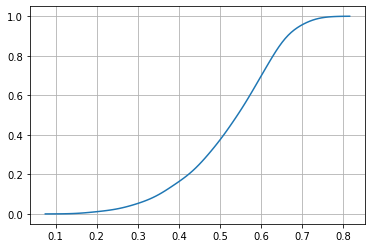
the CDF is useful to compute probabilities of intervals
a = 0.6
b = 0.7
CDF(0.7) - CDF(0.6)
0.25876642048383736
plt.hist(dlen, bins=30, density=True, alpha=.5, label="data");
plt.plot(r, P(r), color="black", label="kde")
plt.grid()

ix = np.linspace(a,b,100)
plt.fill_between(ix, ix*0, P(ix), color="blue", label="P(a<x<b)")
plt.legend();
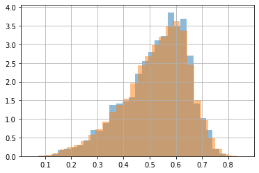
sampling#
we can use also KDE for sampling new data
s = kde.sample(100000)[:,0]
s
array([0.42184934, 0.46310291, 0.69647056, ..., 0.56053133, 0.47391261,
       0.63765577])
plt.hist(dlen, bins=30, density=True, alpha=.5, label="data");
plt.hist(s, bins=30, density=True, alpha=.5, label="samples");
plt.grid()
joint distribution (2D)#
we can also get a density estimate for the joint distribution
dlen = x['length']
dwei = x['whole weight']
g = sns.jointplot(x=dlen, y=dwei, kind="kde")
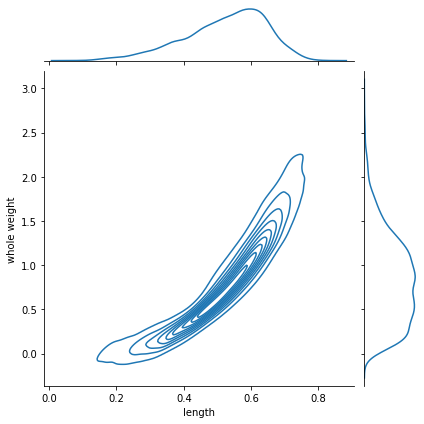
kde2d = KernelDensity(bandwidth=.02).fit(x[['length', 'whole weight']].values)
we can compute the pdf at any point (maybe \(>1\))
P = lambda x: np.exp(kde2d.score_samples(np.r_[x].reshape(-1,2)))
P([0.6,1])
array([7.36728362])
the PDF must integrate up to 1 in all dimensions
with
\(l\): length
\(w\): weight
but observe the two dimensional numerical integration struggles to compute the value.
from scipy.integrate import dblquad
dblquad(lambda x,y: P([x,y]), np.min(dwei), np.max(dwei), lambda k: np.min(dlen), lambda k: np.max(dlen))
(0.9978512269187759, 1.4695629965797308e-08)
and only integration in a 2d interval gives probabilities \(\in [0,1]\)
with \(\square\) being the 2D squared region delimited by \(l_a\), \(l_b\) and \(w_a\), \(w_b\)
and of course the CDF becomes more complex since we need to accumulate in 2D and becomes almost impractical.
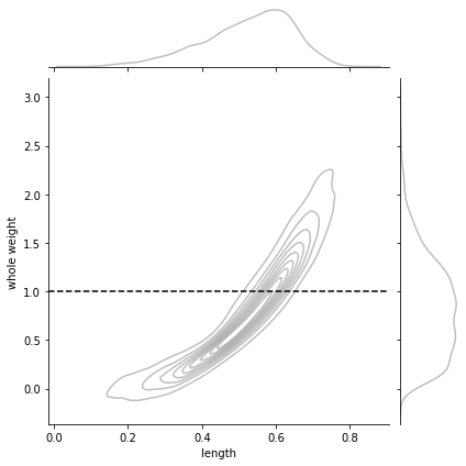
la,lb = 0.5,0.7
wa,wb = 0.9,1.1
pl,pw = 0.6,1.0
g = sns.jointplot(x=dlen, y=dwei, kind="kde",
                  joint_kws={"alpha":.5, "color": "gray"},
                  marginal_kws={"alpha":.5, "color": "gray"})
g.ax_joint.fill_between(np.linspace(la,lb,20), [wa]*20, [wb]*20, color="red", alpha=.5)
g.ax_joint.axvline(la, color="black", ls="--")
g.ax_joint.axvline(lb, color="black", ls="--")
g.ax_joint.axhline(wa, color="black", ls="--")
g.ax_joint.axhline(wb, color="black", ls="--")

g.ax_joint.scatter(pl, pw, color="black", s=50);
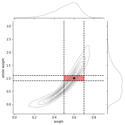
# the integration of the 2D interval
dblquad(lambda x,y: P([x,y]), wa, wb, lambda k: la, lambda k: lb)[0]
0.13280459408413836
# the PDF value of a point within the interval
P([pl,pw])[0]
7.367283620321121
marginals from joint#
observe that every time we want to compute a probability from a marginal for one variable we need to integrate (sum up) across the other variable. This is computationally expensive, even for this small case.
These marginals match the ones as plotted above.
P_len = np.vectorize(lambda x: quad(lambda y: P([x,y]), np.min(dwei), np.max(dwei))[0])
# check marginal integraetes to 1
quad(P_len, np.min(dlen), np.max(dlen))[0]
0.997851226911095
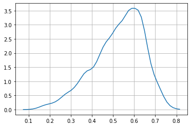
rlen = np.linspace(np.min(dlen), np.max(dlen), 50)
plt.plot(rlen, P_len(rlen))
plt.grid();
observe the numerical instabilities
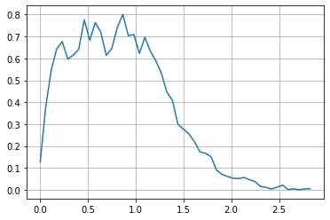
P_wei = np.vectorize(lambda y: quad(lambda x: P([x,y]), np.min(dlen), np.max(dlen))[0])
# check marginal integraetes to 1
quad(P_wei, np.min(dwei), np.max(dwei))[0]
0.9978512269187759
rwei = np.linspace(np.min(dwei), np.max(dwei), 50)
plt.plot(rwei, P_wei(rwei))
plt.grid();
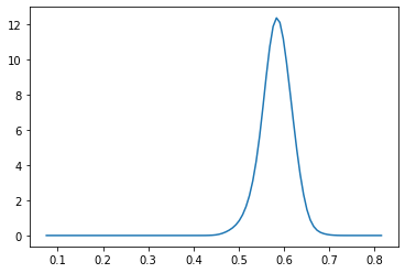
conditionals from joint#
a conditional is just a slice for the conditioned value, normalized so that we have a proper probability distribution
for instance \(P(l|w=1)\) looks as follows
w = 1
g = sns.jointplot(x=dlen, y=dwei, kind="kde",
                  joint_kws={"alpha":.5, "color": "gray"},
                  marginal_kws={"alpha":.5, "color": "gray"})
g.ax_joint.axhline(w, color="black", ls="--", label="w")
<matplotlib.lines.Line2D at 0x7f13428aadf0>
Pu = lambda x: P([x,w]) # unnormalized conditional
Z = quad(Pu, np.min(dlen), np.max(dlen))[0]
Pc = np.vectorize(lambda x: Pu(x)/Z)   # normalized conditional
r = np.linspace(np.min(dlen), np.max(dlen), 100)
plt.plot(r, Pc(r))
[<matplotlib.lines.Line2D at 0x7f134338eee0>]
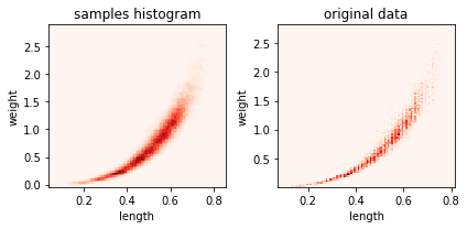
sampling#
for ax,i in subplots(2):
    s = kde2d.sample(100000)

    if i==0:
        plt.hist2d(s[:,0], s[:,1], bins=100, label="samples", cmap=plt.cm.Reds);
        plt.title("samples histogram")
    if i==1:
        plt.hist2d(dlen, dwei, bins=100, label="samples", cmap=plt.cm.Reds);
        plt.title("original data")

    plt.xlabel("length")
    plt.ylabel("weight")
plt.tight_layout()
s
array([[0.51530533, 0.6138152 ],
       [0.63590029, 1.1842212 ],
       [0.57986584, 0.7704644 ],
       ...,
       [0.42625826, 0.25589309],
       [0.52939054, 0.57865795],
       [0.49685327, 0.7903932 ]])
len(s), len(dlen)
(100000, 4177)